MICROSOFT INC.
Production/branding/Infographics/ PowerPoint/Illustration
At Microsoft INC., my job was to condense an overwhelming amount of information into an easy to understand PowerPoint presentation. Every month I helped to create 50+ page PowerPoint decks on a tight turnaround. In addition, I helped with branding, illustrations, and infographics. It was often fast-paced with a lot of urgent cross-team communication. My team was agile, focused, and diverse.
THE CHALLENGE
Overly crowded graphics like this were too confusing to understand. It was my job to determine the main message of the graphic and distill it down to its simplest form.
Animated Solutions
My solution was to create an animated series of PowerPoint slides that broke the information into digestible chunks.
POWERPOINT CREATION
The majority of my work was distilling a large amount of information into a PowerPoint presentation that could be understood at a glance. These were 50+ pages and required working across Microsoft to align messages from numerous teams. Three graphic designers worked late nights to create presentations with a uniform look and message. Unfortunately, much of this work involved inside strategy that remains confidential, but I can include a handful of screenshots. Below are demo redesign instructions delivered and designed inside of PowerPoint.
Website And Email Design
These websites, emails and logos were created for fake universities and companies. They were ultimately used in software demos.
VECTOR ICON CREATION
I was asked to create vector icons for “Inclusion”, “Industry”, “Reward” and “Growth”. I started with hand-drawn sketches to brainstorm ideas based on the keywords. These sketches were parsed by my art director who selected the versions to digitize and refine. Below you can see the final vector icons.
Vector Cards
The challenge was to create vector icon illustrations to appear on digital cards with our 9 company tennants. Again the process begins with paper and pencil, followed by digital refinement toward the final design.
ISV Graphic
In creating the information-heavy ISV Opportunity View, I brainstormed dozens of different iterations in Illustrator before landing on the highly simplified version below.
The Tapir Email Newsletter
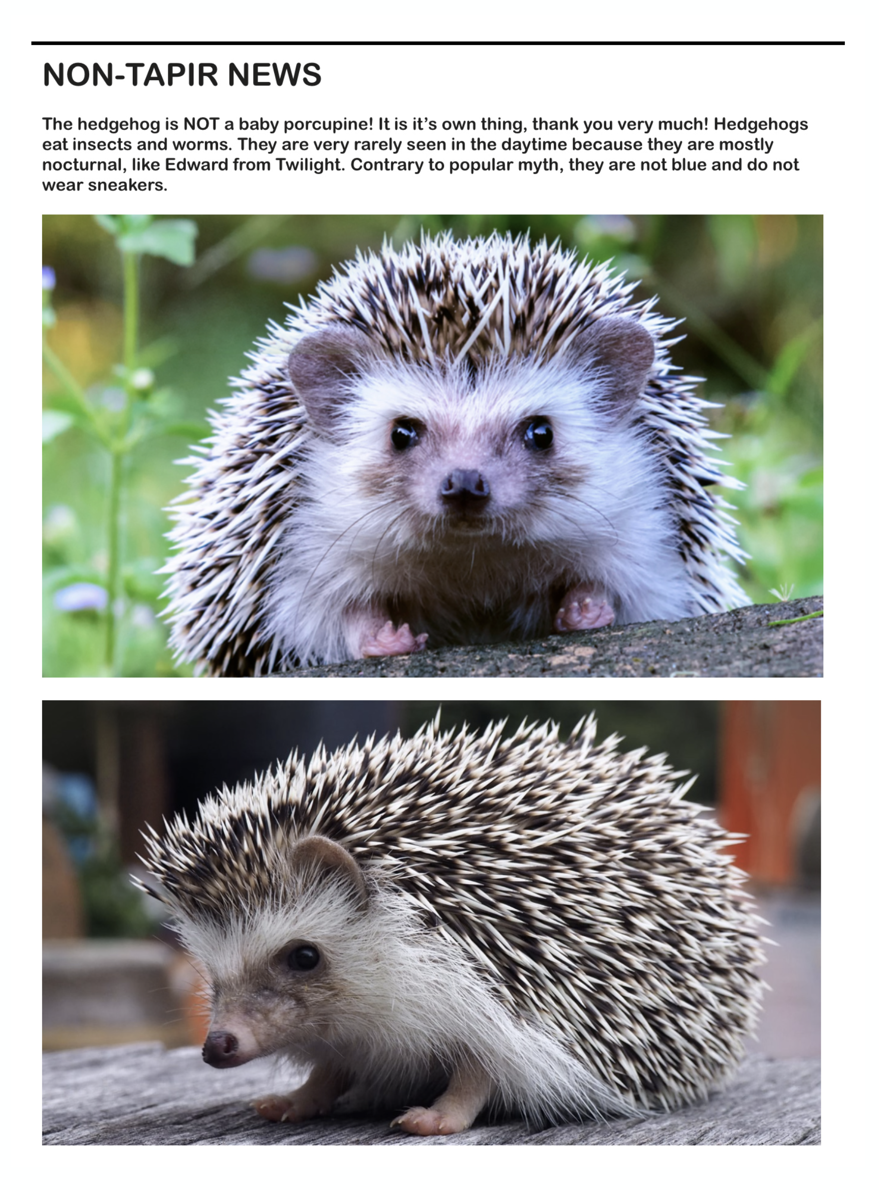
The Tapir was a weekly email newsletter designed to be cheerful alternative to the seemingly endless grim news of 2020. It primarily brought updates - both real and imagined - concerning the weird South American pig known as the tapir. Tapirs are inherently cheerful with their prehensile snouts and goofy behavior. Every week I wrote tapir poems, character studies, and puzzles, augmented by odd photos, illustrations, and other wildlife news. These emails - done on a whim - became very popular with the team and help to lighten the mood during a difficult time.


